
introduction
To design a brochure on Vistaprint, choose a fold style and size that suits your content, build your layout from a template or your own artwork, keep important text inside the safe area, extend backgrounds into the bleed, use 300 DPI images, and check the proof carefully before ordering. This guide explains each of those steps in detail so you can avoid common mistakes and produce a brochure that looks professional.
What Is a Vistaprint Brochure?
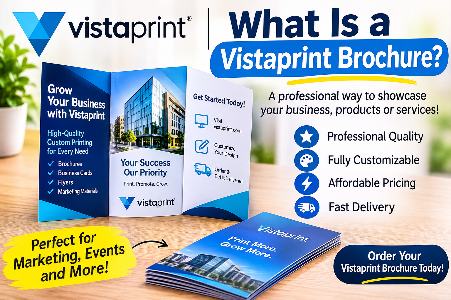
A Vistaprint brochure is a printed marketing piece, usually a folded sheet of paper, ordered through Vistaprint’s online print service. Businesses use brochures to explain services, present product ranges, promote events and leave something tangible in a customer’s hands.
Vistaprint lets you design inside its online editor using templates, or upload finished artwork created in tools such as Adobe InDesign, Illustrator, Photoshop or Canva. Available sizes, folds, paper finishes and quantities change over time and vary by region, so always confirm the current options on the Vistaprint product page before you finalize a design.
Step 1: Define the Goal Before You Open the Editor
A brochure that tries to do everything usually persuades no one. Before you start designing, answer three questions. Who is the reader? What single action should they take after reading? How will the brochure be delivered?
The reader matters because a homeowner comparing contractors needs very different content from a procurement manager reviewing suppliers. The action matters because every panel should lead toward it, whether that is a phone call, a website visit, a QR code scan or a booking. The delivery method matters because a brochure handed out at a trade show can be bold and visual, while one placed in a clinic waiting room should be calm, clear and information-led.
Your answers decide the length, the tone and the fold you choose in the next step.
Step 2: Choose the Right Fold Style
The fold controls the order in which people discover your content, so it is a design decision, not just a printing option. A flat single sheet suits simple offers, menus and one-page summaries. A bi-fold creates four panels and works well for short company profiles and product highlights. A tri-fold creates six panels and suits service lists and step-by-step explanations. A Z-fold also creates six panels and is ideal for sequential stories such as before-and-after content. A gate-fold opens like double doors and gives a premium feel for launches and portfolios.
The tri-fold is the most popular choice because the cover, the inside panels and the back panel each have a clear job. Choose a bi-fold when you have less content and want larger imagery. Choose a Z-fold when you want the reader to unfold the story in a deliberate order. Check which formats Vistaprint currently offers for your region before committing to a layout.
Step 3: Understand Trim Size, Bleed and Safe Area
Three technical terms decide whether your brochure looks professional or amateur. Trim size is the final size of the brochure after it has been cut. Bleed is the extra background area, commonly about 0.125 inch or 3 mm, that extends beyond the trim line so that no thin white edges appear after cutting. The safe area is an inner margin where all important text and logos must stay so that nothing is cut off or sits too close to an edge.
The working rule is simple. Backgrounds and images that touch the edge extend into the bleed, while text, logos and key graphics stay inside the safe area. Use the exact template dimensions Vistaprint provides for your chosen product instead of guessing, because the required bleed and margins are specific to each product.
Folds introduce another risk. Paper shifts slightly during folding, so avoid placing faces, phone numbers or headlines directly on a fold line.
Step 4: Plan the Content Panel by Panel
A tri-fold brochure works best when each panel has one clear job. The front cover carries your brand name, a clear promise and one strong image, and it has to work in about three seconds. The inner flap, which readers see first when they open the brochure, should hold a short summary or offer that pulls them inside.
Inside, the left panel can describe the problem or need your reader has, the center panel can present your solution through key services or products, and the right panel can offer proof such as testimonials, results or certifications. The back panel closes with contact details, your website, a QR code and a direct next step.
Write for scanning. Use short headings, short paragraphs and benefit-led sentences. A line such as “Cut your energy bill with certified insulation” works better than “We offer insulation services,” because it tells the reader what they gain.
Step 5: Apply Strong Layout and Typography Rules
Good layout is mostly restraint. Start with a clear hierarchy: one headline size, one subheading size and one body size, so readers always know where to look first. Limit yourself to two fonts, one for headings and one for body text, because more than that looks inconsistent.
For print, body copy generally reads best at around 9 to 11 point with comfortable line spacing. Leave generous white space, since empty space makes a brochure feel premium and makes the content easier to absorb. Align everything to a grid with consistent margins and column widths so the piece feels designed rather than assembled.
Check contrast carefully. Dark text on a light background is the safest choice. If you place text over a photo, add a semi-transparent overlay or choose a plain area of the image so the words stay readable.
Step 6: Choose Colors That Print Accurately
Screens use RGB color, while printers use CMYK. Bright neon blues, greens and oranges can look duller in print because some RGB colors fall outside the CMYK range. If your software allows it, design in CMYK from the start so the colors you see are closer to the printed result.
Use your brand colors consistently, with one dominant color and one accent. Avoid very large areas of heavy dark ink, which can look uneven on paper. Remember that screen brightness changes how color appears, so treat a digital proof as a guide rather than an exact color match.
Step 7: Use High-Quality Images and Graphics
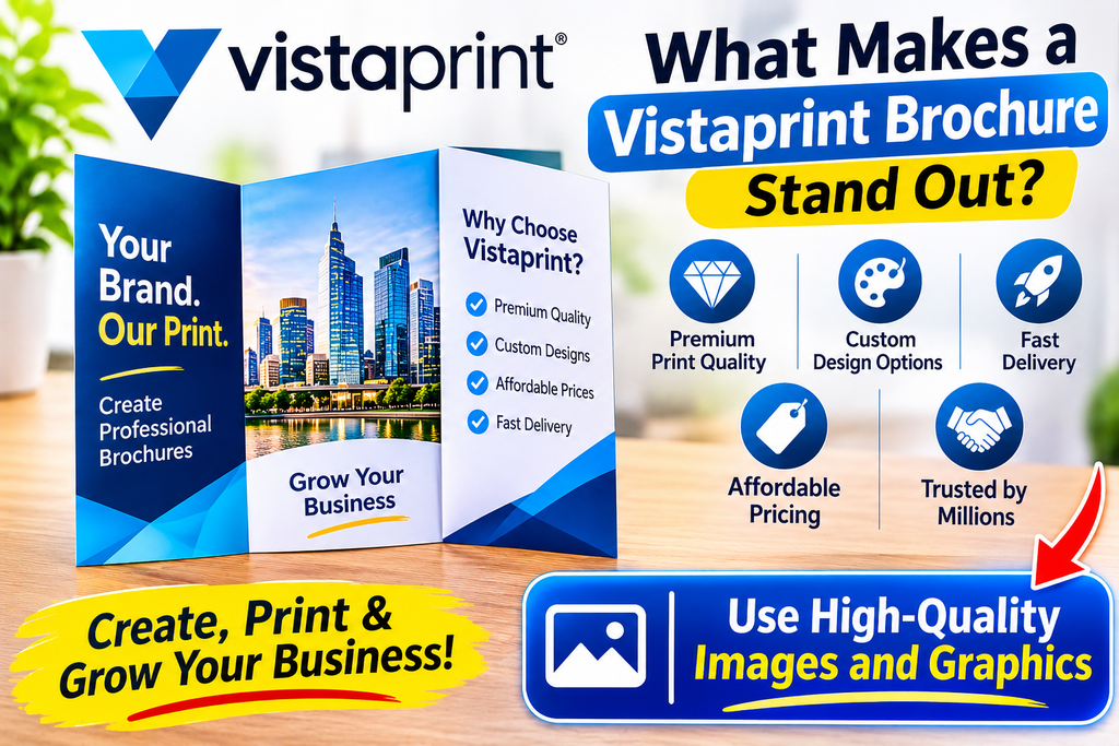
Image quality is the fastest way for a brochure to look either professional or cheap. Use images at 300 DPI at their final printed size, and never stretch a small web image to fill a panel, because it will print blurry. Real photos of your products, team or work usually build more trust than generic stock photography.
Use vector logos in SVG, EPS or PDF format so they stay sharp at any size, and keep icons and illustrations in one consistent style. A simple test helps here: if an image looks soft at 100 percent zoom on your screen, it will look soft in print.
Step 8: Choose Paper and Finish With Purpose
Paper changes how people feel about your brand before they read a single word. Vistaprint typically offers several paper weights and finishes, so compare the current options on the product page.
A matte finish feels elegant, reduces glare and suits text-heavy brochures. A gloss finish makes colors vibrant and works well for photography and product-led designs. Heavier stock feels more premium and durable, which is useful for brochures you want people to keep, while lighter stock is cost-effective for mass distribution or mailing. If your brochure will be handled often, for example in a showroom, choose a sturdier option.
Step 9: Prepare Your File Correctly
If you upload your own artwork instead of using the online editor, a few checks prevent most printing problems. Use the template or exact dimensions provided for your product, include the required bleed, and keep all critical content inside the safe area. Embed or outline your fonts, and export a high-quality print-ready PDF with images at 300 DPI, in CMYK where possible.
The most common mistake with folded brochures is panel order. Print a plain paper mock-up, fold it, and confirm that every panel appears where you expect it to before you upload the final file.
Step 10: Proof Carefully Before You Order
Once an order is placed, a mistake cannot be reversed, so proofing deserves real attention. Check the spelling, grammar and punctuation of every panel. Test every phone number, email address, URL and QR code. Verify your business name, address and opening hours, and confirm that prices, dates and offers are correct. Zoom in to check image resolution, and make sure no text sits too close to an edge or a fold.
Then read the whole brochure aloud once, because this catches errors your eyes skip. Finally, hand it to someone who has never seen it, give them 30 seconds, and ask what you want them to do next. If they cannot answer, simplify your call to action.
Common Vistaprint Brochure Design Mistakes
The first common mistake is too much text. A brochure should guide interest, not replace your website. The second is a missing call to action, since every brochure needs a clear next step. The third is ignoring bleed and safe margins, which leads to white edges or cut-off text.
Low-resolution photos are the most visible quality problem, and a weak cover is the most costly one, because if the front fails the inside never gets read. Inconsistent branding, with mixed fonts, colors and logo versions, reduces trust. Skipping the proof is the last major mistake, because a small typo looks very big when it is printed 500 times.
How to Connect Your Brochure With Your Digital Presence
A modern brochure should work together with your online presence. Add a QR code that links to a specific landing page instead of your homepage, and use a short, memorable URL. Make sure the wording and branding match your website, so readers recognize you instantly when they move from print to screen.
Tracking matters as well. Use a unique link or offer code on each brochure batch so you can measure which distribution channel brings the best results.
Key Takeaways
Start with the reader and one clear goal. Pick the fold that fits your content, usually a tri-fold for services and a bi-fold for simpler stories. Respect trim size, bleed and safe area, give each panel one job, and finish with a call to action. Use two fonts, a strong hierarchy and plenty of white space, along with 300 DPI images and consistent brand colors. Check Vistaprint’s current paper and finish options, and always proof, fold a mock-up and test every link and QR code.
FAQ
What is the best size for a Vistaprint brochure?
The best size depends on your content and fold style. A tri-fold is the most common choice for service and company brochures. Confirm the sizes currently available on Vistaprint’s product page and use the matching template.
How much bleed does a brochure need?
Many print templates use about 0.125 inch or 3 mm of bleed, but you should always follow the exact bleed shown in the Vistaprint template for your chosen product.
What resolution should brochure images be?
Use 300 DPI at the final printed size for sharp results. Images taken from websites are usually too low in resolution for print.
Can I upload my own brochure design to Vistaprint?
Yes. Vistaprint supports uploading your own artwork, typically as a print-ready PDF. Follow the template guidelines for size, bleed and safe area.
Should I use RGB or CMYK for print?
CMYK is the standard for print. Designing in CMYK helps you avoid surprises where bright screen colors look duller on paper.
Is a tri-fold or bi-fold brochure better?
A tri-fold suits structured content with several points, while a bi-fold suits shorter content with larger visuals and fewer sections.
How do I make my brochure look professional?
Use consistent branding, high-resolution images, a clear hierarchy, generous white space, no more than two fonts and one clear call to action.
Conclusion
A strong Vistaprint brochure is the result of planning, not decoration. Decide who it is for, choose a fold that fits the story, respect the technical rules of bleed and safe area, and give every panel a clear role. Combine sharp images, readable typography and a direct call to action, then proof it with the same care you would give a contract. Do that, and your brochure will do what great print does: earn attention, build trust and move the reader to act.